
When it comes to interior design, few elements hold as much power as the colour palette. Choosing the right colours can transform a space from ordinary to extraordinary, creating an atmosphere that reflects your personality and style. In this blog post, we'll delve into the art of curating a harmonious colour palette for your home, exploring key principles and tips that will help you achieve a visually stunning and inviting home you'll love!
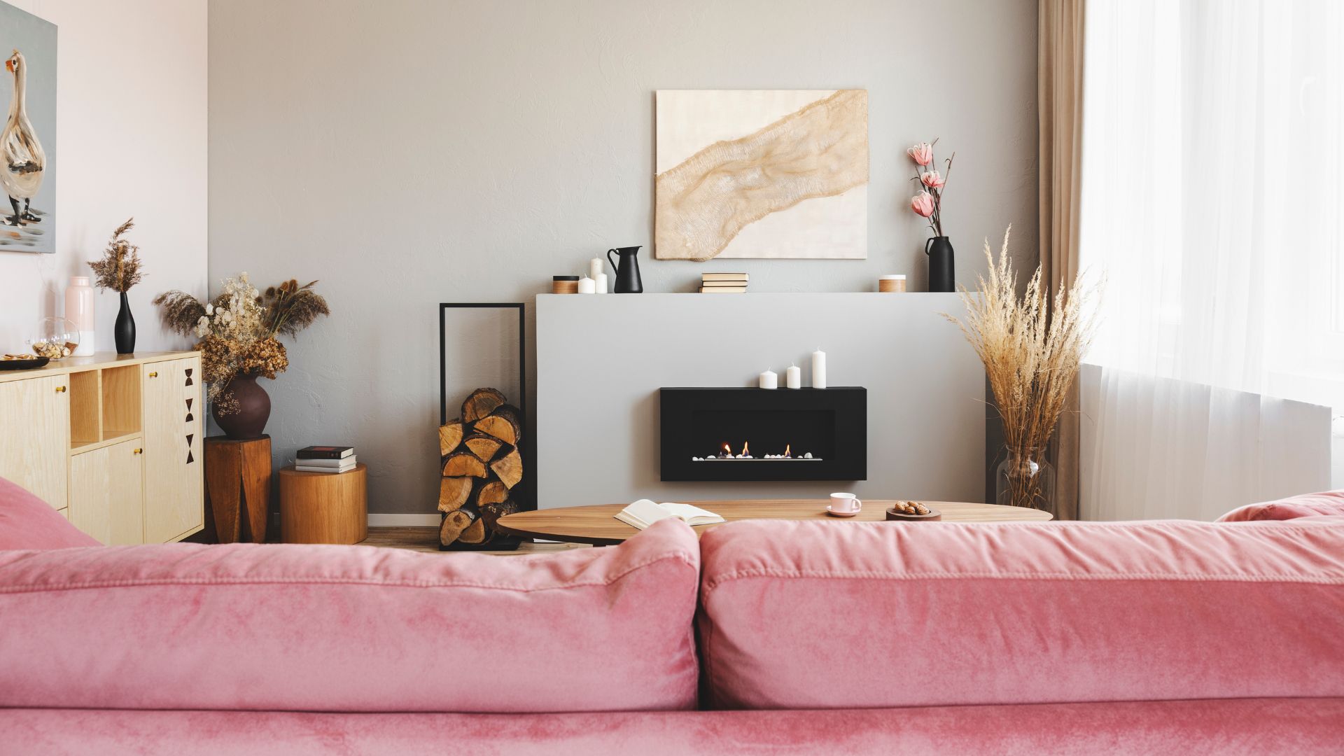
Start with a Solid Foundation: Choosing the Base Colour Every successful design project begins with a solid foundation, and in the realm of colour palettes, this foundation is your base colour. Typically a neutral or subtle shade, the base colour sets the tone for the entire room. Consider timeless options like soft beige, warm gray, or a calming creamy white. This versatile backdrop serves as the canvas upon which you'll build the rest of your colour scheme.

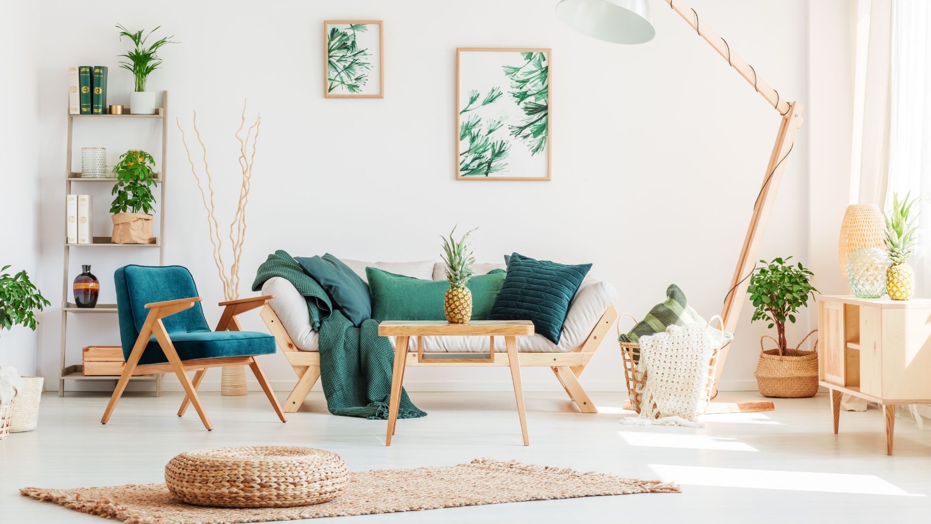
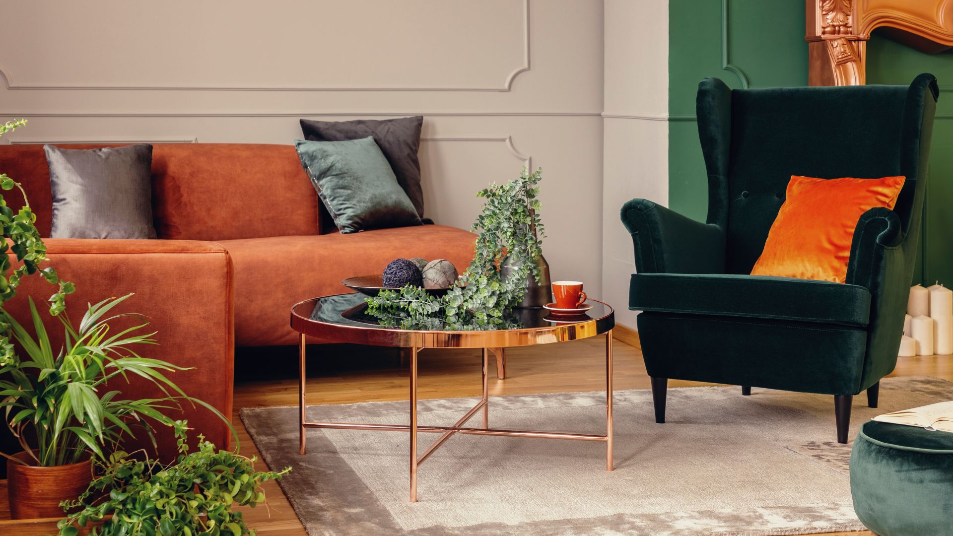
Layering with Accent Colours: Adding Personality and Depth To infuse character and depth into your design, incorporate accent colours that complement your base shade. These colours can be more vibrant and impactful, adding visual interest to the space. Whether it's a deep blue, a rich burgundy, or a lively green, these accent colours can be strategically applied to furniture, artwork, or smaller decor elements. Experiment with different combinations to find the right balance and harmony.
Following the 60-30-10 Rule: Achieving Balance and Proportion. Achieving a balanced colour palette is about distribution, and the 60-30-10 rule is your guiding principle. Allocate 60% of the room to the dominant colour, which includes walls and larger furniture pieces. The secondary colour takes up 30% and encompasses upholstery, drapes, and other mid-sized items. Finally, the accent colour occupies the remaining 10%, appearing in accessories, decorative accents, and smaller decor elements. This distribution creates a harmonious and visually pleasing composition.
Harnessing the Power of Colour Psychology: Setting the mood colours has a profound impact on our emotions and perceptions. Consider the mood you wish to create in each space. Blues and greens evoke calmness, while warm yellows and oranges bring energy and vibrancy. Neutrals promote balance and simplicity, while darker tones introduce a touch of drama. Tailor your colour choices to the function of the room and the ambiance you want to cultivate.
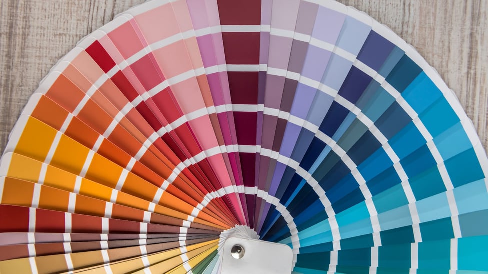
Testing and Sampling: Ensuring a Perfect Match Before committing to a colour palette, it's essential to test and sample. Paint swatches and fabric samples should be observed in various lighting conditions to see how they interact with each other and the space as a whole. Natural and artificial lighting can significantly affect how colours appear, so taking the time to assess these variables will save you potential disappointment later on.

The Art of Balancing Warm and Cool Tones A successful colour palette often includes a mix of warm and cool tones. Warm colours like reds, oranges, and yellows can create a cozy and inviting feel, while cool colours such as blues and greens offer a sense of calm and tranquility. Combining these elements thoughtfully can result in a balanced and dynamic colour scheme.
Mastering the art of curating a harmonious colour palette is a cornerstone of interior design. By carefully selecting a base colour, layering with accent shades, adhering to the 60-30-10 rule, considering colour psychology, testing samples, and balancing warm and cool tones, you can create a visually captivating and emotionally resonant living space that reflects your unique style and enhances your everyday experience. Your home is your canvas – let your colour palette be your masterpiece.